Using White in Design
White is a powerful design element in POD, bringing brightness, balance, and a sense of purity to your creations. Whether used as a clean canvas or a highlight, white templates offer a sophisticated, minimalist backdrop that makes your designs feel fresh and timeless.





Variations of White
When it comes to creating standout products, many POD sellers overlook the power of subtle color choices, like white. It may seem like a simple, one-size-fits-all color, but in reality, white comes in a wide range of shades, each with its own vibe and visual impact. Whether you’re designing apparel, home decor, or accessories, the right shade of white can help your product feel modern, vintage, minimalist, or luxurious. Let’s dive into the most popular and versatile shades of white, and how to use them to match your brand’s style and connect with your target audience.
Pure White
#FFFFFF
This is white in its purest and most authentic form. It is characterized by being extremely bright, crisp, and completely free from additional tone blends.
Antique White
#FAEBD7
The hue of antique white evokes a sense of elegance and nostalgia. It's a warm white that resembles paper aged over time.
Ivory
#FFFFF0
As its name suggests, ivory white, inspired by this precious material, is a white variant combined with a delicate yellowish hue. This choice of tone conveys elegance and warmth.
Snow White
#FFFAFA
This white hue embodies snow's freshness and immaculate purity. It brings a sense of cleanliness, clarity, and serenity to any design, conveying an atmosphere of calm and freshness.
Eggshell
#F0EAD6
Inspired by the texture of an eggshell, this white evokes softness and delicacy. This shade is characterized by its warmth, providing a cozy and neutral sensation that conveys calm and tranquility.
Cream
#FFFDD0
Cream white is inspired by the smoothness of cream blended into hot beverages like coffee. This white variant conveys a relaxing, velvety, and sophisticated sensation.
Linen White
#FAF0E6
Originating from the delicate and smooth texture of linen, this subtly muted tone is perfect for conveying peace, balance, and naturalness. Additionally, it's a timeless white that can be used across multiple industries.
Pearl White
#F0F8FF
With a gentle touch of a blue undertone, pearl white, drawing inspiration from marine pearls, is ideal for invoking luminosity and elegance. In addition to conveying serenity, peace, and calmness, it also adds a sense of depth.
Cotton White
#F7EFE3
This white evokes the softness and freshness characteristic of white cotton. Thanks to its slightly warm undertone, it conveys a sense of purity and cleanliness, inviting a cozy and tranquil atmosphere.
What Colors Go With White?
White is one of the most versatile colors in your POD toolkit, clean, timeless, and easy to pair. But choosing the right colors to match with white can take your designs from basic to bold. Whether you're working on apparel, mugs, or wall art, the right color combos can make your products pop and appeal to more customers. Let’s explore the best colors to pair with white to create eye-catching, high-converting designs.
by themes

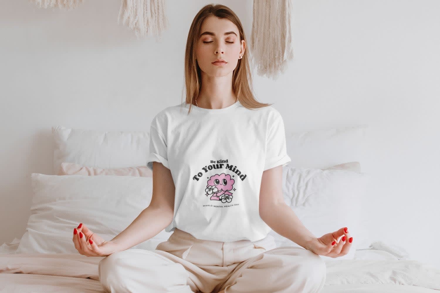
The Meaning of White
White has always been a go-to color for conveying purity, clarity, and calm and it’s just as powerful in your POD products. Its neutral, adaptable nature makes it a staple across niches, from minimalist t-shirts to elegant home decor. White adds a sense of freshness, space, and sophistication to your designs, helping your products feel clean and modern.
But like any color, white can send the wrong message if overused. Too much white can come off as cold, distant, or uninviting. The key is to balance it with complementary elements, colors, textures, or typography, to keep your design approachable and engaging. When used thoughtfully, white can elevate your products and create a polished, high-end look that resonates with your target audience.
The Color Psychology of White
Positive Aspects of White
- White has several meanings that encompass balance, tranquility, spirituality, purity, peace, and innocence. In numerous cultures, especially in the Western world, it is attributed to a connection to the sacred, the divine, and the healing. Therefore, it is recurrent in celebrations, religious events, and other related contexts.
- This color also symbolizes simplicity, cleanliness, hygiene, and luminosity. This quality makes it a resource for creating the illusion of spaces larger than they actually are and for infusing environments with a positive sense of balance, light, harmony, and serenity.
- Likewise, white acts as a neutral color that is also incredibly versatile. This means it can blend with a wide variety of colors.
Negative Aspects of White
- As negative generalities associated with the color white, many people may attribute it with connotations of emptiness, weakness, coldness, and even boredom.
- As we mentioned, white conveys a sense of emptiness and boredom, as in white, there is nothing. This also leads us to coldness, insensitivity, and a lack of warmth.
- Likewise, it is often associated with weakness. The color white holds a certain vulnerability because, seen from a negative perspective, it can be easily spoiled. This is why it is also linked to illness and vulnerability. Similarly, it can affect readability and clarity when not used or contrasted properly.
Embrace the Timeless Sophistication of the Pure White Color in Your Creations
Whether you aim to infuse elegance, purity, or tranquility into your designs, white provides an immaculate canvas for limitless creativity. Discover the enchanting potential of this pristine shade in Placeit's templates.
White Templates







Which Industries Commonly Use the Color White?
Healthcare: In this industry, white is essential for conveying cleanliness and safety, indicating the sanitization of spaces. Furthermore, white symbolizes trust, transparency, and professionalism, reinforcing a sense of security when dealing with patients' lives. Brands like: Calm, Nuffielc Health, and VCU Health




Non-Governmental Organizations: White is often chosen in this type of organization, as it is linked to their seriousness and transparency, conveying simplicity, trust, and innocence. It is preferred by those organizations aiming to express values such as transparency, equality, and hope. Brands like: World Wildlife Fund (WWF), International Committee of the Red Cross (ICRC), and Amnesty International.




Fashion: In the world of fashion, white stands out as a highly versatile color, easily combinable, and has gained popularity in recent years for its clean and minimalist appearance. Moreover, in wedding events, it remains the most favored choice for conveying elegance, purity, innocence, and new beginnings. Brands like: Off-White™, Versace, and The North Face.



Interior Design: White is extensively employed in this industry due to its remarkable versatility that blends seamlessly with countless shades. It's the go-to tone for its ability to illuminate, expand spaces, and create a serene and calm environment. Additionally, white conveys a sense of cleanliness, organization, and timeless sophistication. Brands like: MAWD (March and White Design), Studio White Interiors, and Remedy Design Firm.



Want to explore another color?


